Oil painting techniques: learn how to “scumble” like a pro

Snowy Dawn oil painting by Francisco Silva
“Snowy Dawn” oil painting by Francisco Silva

Scumbling is an oil painting technique used by many painter’s throughout history. To achieve this technique, you apply a thin or transparent layer of paint over a dried layer of paint resulting in a visual, color combination of both layers.

Why you should use this technique

As artists, we’re always running into roadblocks during the painting process. Scumbling can be used as a potential solution during these times. You can use it to add depth by adding contrasting color layers if your painting is too monotone. Conversely, you can reduce contrast in an area with this technique.

How to start scumbling using oil paint

  • Begin with a dried base layer of paint.
  • You can use either a transparent color (like Perylene Red, Viridian Green, etc.) or “thin” out a paint color with a medium.
  • Apply the transparent color. I control the transparency by adding medium to achieve a thinner layer of oil paint.
  • You can apply more layers to deepen the color or add more layers of different colors. Pleas note that the more layers you add, the less the initial layer will be noticeable.

Scumbling examples

Detail of Turner’s painting “Sun Setting Over a Lake”. Click on the image to see the entire painting

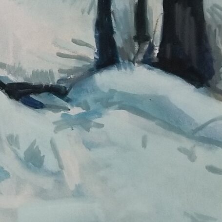
Throughout the history of art, many painters have used this technique. In the detail above, I show how J.M.W. Turner used this technique. You can see the layers of different colors which add texture and depth to the painting. Additionally, the darker areas of this detail are achieved with scumbling. This is a common technique used by Turner.

Detail of “Snowy Dawn” by Francisco Silva

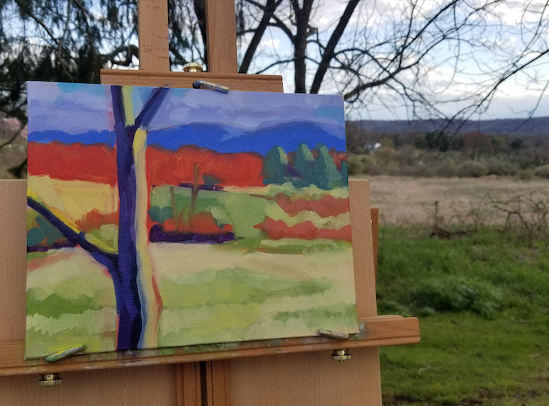
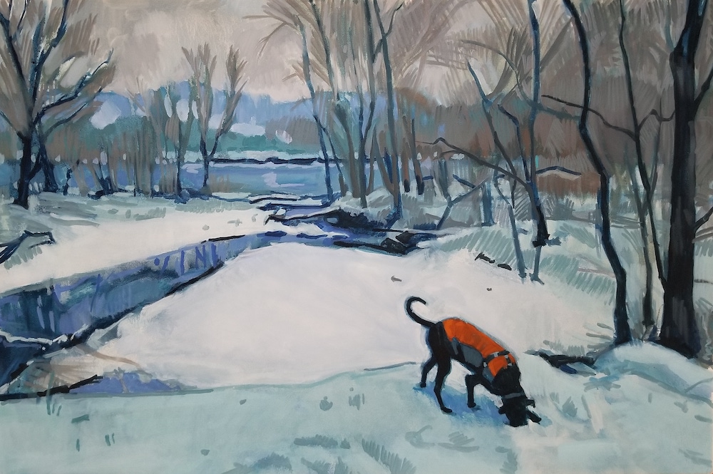
One of the challenges with this painting was to represent “snow” without using one flat “white” layer of paint. I achieved this by beginning with a light blue-green base layer. To this layer, I added a light blue layer that was lighter than the previous layer. In the third layer, I added a white (toned-down with gray) layer leaving me the option of using pure white very sparingly.

Summary

  1. Scumbling can be used as a solution to visually problematic areas in your painting.
  2. Use scumbling to add color depth.
  3. Use this technique to highlight an area or reduce a high-contrast area.
  4. Scumbling is a classic technique used by many painters of the past (J.M.W. Turner, Claude Monet).
  5. Scumbling adds an additional technique to your painting arsenal.

Do you scumble? How have you used it in the past? Please leave examples in the comments.

Thumbnail sketches are the answer to your plein air painting problems

Four gray tonal thumbnail sketches

Have you ever worked on a plein air painting only to realize that some serious compositional issues existed halfway through the painting? The purpose of this post is to show you how you can use thumbnail sketches to work out these problems before you lay down any paint.

What are the advantages of using thumbnail sketches?

  • To quickly sketch different views of the subject matter
  • To crop a view to make it more visually interesting
  • Thumbnails help establish a strong composition
  • They reduce visual elements to values and shapes thereby making the painting process easier

What’s the process for creating thumbnail sketches?

I start with a 5b or 6b drawing pencil which allows me to get a dark black. I quickly sketch a small box (approximately 2”x3”) that’s proportional to the canvas or panel that I’ll be painting on. I sketch loosely and reduce the subject matter to simple, large shapes and tonal values. I limit my sketching time to 3 or 4 minutes to avoid getting bogged down with any detail. Finally, I use this thumbnail to lay out my painting.

Using this method I can create different thumbnails from different angles giving me options to choose from. Additionally, these sketches help me decide what view will work out best as a painting.

Examples of usage

Please note the four thumbnails on the top of this post. I’ve sketched out a couple of thumbnails to choose from. I think the top two are boring . The bottom two have a better composition with a strong focal point. But the bottom-right one is a better value study and I chose this one to create a painting.

Below you can see the quick thumbnail sketch that I used to begin the painting on the right. Looking back, I should’ve better developed the different values in the thumbnail.

Thumbnail tonal sketch on the left and beginning stage of the plein air painting on the right

How they improve your plein air painting

  • A thumbnail sketch will quickly show if a view is worth painting
  • Give the ability to crop or change elements that won’t work in the painting
  • Help in the painting process by simplifying the view to simple shapes and tonal values
  • You can quickly rework elements to improve the composition

Summary

  1. When painting plein air, use thumbnail sketches to quickly lay out your painting
  2. Sketch out approximately 2”x3” boxes that match the proportions of your painting surface
  3. Work out any compositional issues in the thumbnail
  4. Establish tonal values in the thumbnail that can transferred to the painting
  5. Use the thumbnail to lay out your painting

Do you use thumbnail sketches when painting plein air? How do you avoid compositional problems?

Oil painting basics: reasons to tone your oil painting canvas

Photo of the canvas toning process using Ultramarine Blue and Burnt Sienna

Why do you tone a canvas?

  • To make a “white” canvas or panel less intimidating to paint
  • Toning creates a neutral background
  • It covers the entire surface leaving no areas of blank (white) canvas

How do you tone a canvas for oil painting?

In my experience earth colors work best. My preferred color is Burnt Sienna but I’ve also used Burnt Umber. Additionally, I’ve experimented with Ultramarine Blue and Perylene Red.

I use a rag dipped in Turpenoid. Then I dip the rag into a glob of paint on my palette. Finally, I cover the canvas with a thin layer of that paint. Make sure to let the background color fully dry before you begin painting. If wet, any colors you apply will mix with the background and muddy your colors.

CAUTION: Be careful when using strong colors like Ultramarine Blue or Perylene Red. When I’ve used Perylene Red, I struggled throughout the painting process to tame the strength of that color. This can be very frustrating.

Examples of usage

Plein air landscape painting on easel by Francisco Silva

In the plein air painting above I used a Burnt Sienna background. Although strong colors dominate this painting, you can see hints of the background color through some parts it. Look at the reds as well as the yellows in the lower part of the painting.

“Forever” oil painting by Francisco Silva

“Forever” shows the usage of an Ultramarine Blue background. After my negative experience using Perylene Red, I used this blue background as a foundation for a monochromatic painting. The blue contrasts nicely with the highlights as well as the yellows in the painting.

How it improves your painting

  • It creates a neutral base that you can build upon
  • It’s particularly helpful when plein air painting when you’re fighting against time to capture a scene. The neutral background covers the entire panel eliminating the need to cover it with the paint you’re applying.

Summary

  1. Tone your canvas to create a neutral background
  2. Use earth colors (Burnt Sienna, Burnt Umber)
  3. Be cautious of using strong colors as a background
  4. Toning creates a layer of color that you can build on
  5. Helpful when plein air painting as you have a limited time to paint

Do you tone your canvas? What color(s) do you use? What have been your experiences with toned canvases?