When: Febuary 6 – March 21, 2021 Where: ART150 Gallery, Jersey City, NJ
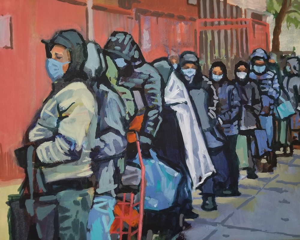
This is a video by News 12 reporting on “The Empowering: A Social Justice Exhibition” organized by Pro Arts Jersey City. My oil painting titled “The Immigrants” is highlighted in the video. Kudos to artist Danielle Scott for curating this moving and thought-provoking exhibition.
When: January 15 – February 19, 2021 Where: Studio Montclair, Montclair, NJ
A curatorial talk by artist Theda Sandiford who curated this exhibition. The video walks us through the exhibition and then Theda talks about several artworks including my painting “The Lack of Privilege“. I was lucky enough to have my painting sold at the exhibition.
Scumbling is an oil painting technique used by many painter’s throughout history. To achieve this technique, you apply a thin or transparent layer of paint over a dried layer of paint resulting in a visual, color combination of both layers.
Why you should use this technique
As artists, we’re always running into roadblocks during the painting process. Scumbling can be used as a potential solution during these times. You can use it to add depth by adding contrasting color layers if your painting is too monotone. Conversely, you can reduce contrast in an area with this technique.
How to start scumbling using oil paint
Begin with a dried base layer of paint.
You can use either a transparent color (like Perylene Red, Viridian Green, etc.) or “thin” out a paint color with a medium.
Apply the transparent color. I control the transparency by adding medium to achieve a thinner layer of oil paint.
You can apply more layers to deepen the color or add more layers of different colors. Pleas note that the more layers you add, the less the initial layer will be noticeable.
Scumbling examples
Detail of Turner’s painting “Sun Setting Over a Lake”. Click on the image to see the entire painting
Throughout the history of art, many painters have used this technique. In the detail above, I show how J.M.W. Turner used this technique. You can see the layers of different colors which add texture and depth to the painting. Additionally, the darker areas of this detail are achieved with scumbling. This is a common technique used by Turner.
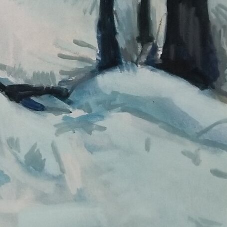
Detail of “Snowy Dawn” by Francisco Silva
One of the challenges with this painting was to represent “snow” without using one flat “white” layer of paint. I achieved this by beginning with a light blue-green base layer. To this layer, I added a light blue layer that was lighter than the previous layer. In the third layer, I added a white (toned-down with gray) layer leaving me the option of using pure white very sparingly.
Summary
Scumbling can be used as a solution to visually problematic areas in your painting.
Use scumbling to add color depth.
Use this technique to highlight an area or reduce a high-contrast area.
Scumbling is a classic technique used by many painters of the past (J.M.W. Turner, Claude Monet).
Scumbling adds an additional technique to your painting arsenal.
Do you scumble? How have you used it in the past? Please leave examples in the comments.
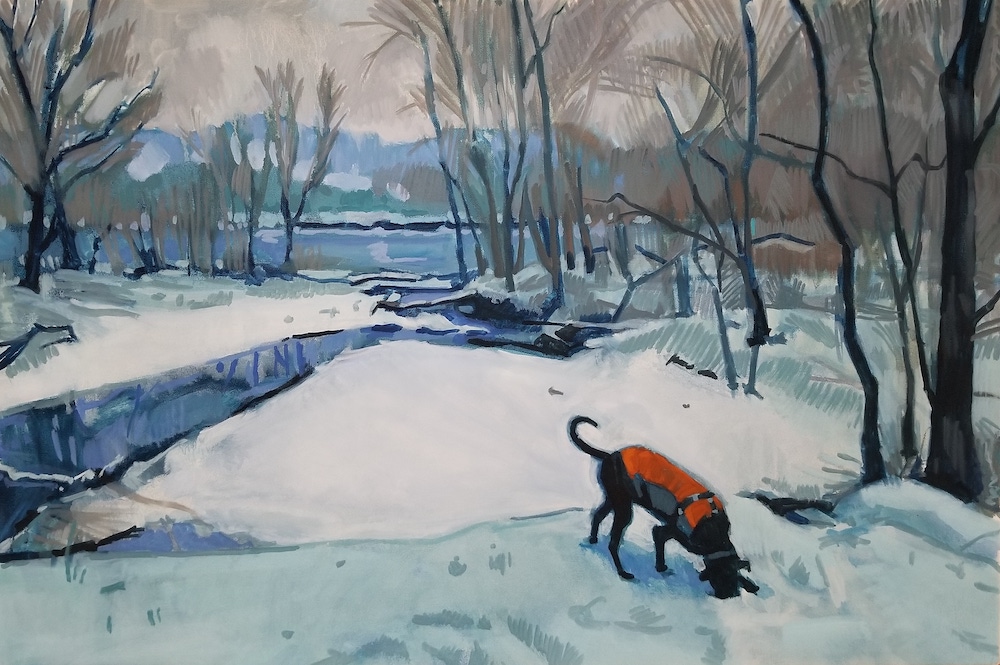
“The Lack of Privilege”, an oil painting by Francisco Silva
One of my paintings is currently on view at the Studio Montclair art gallery. Additionally, an online exhibit compliments the physical show. This group show titled “Privilege, Power and Everyday Life” showcases 32 artists and their interpretation of the theme. Click here for a detailed view of my painting. Click here to view the entire exhibit.
The concept
Titled “The Lack of Privilege”, my new oil painting deals with an unexpected consequence of the pandemic: I depict a food line in Queens in a latino neighborhood. COVID-19 has been devastating to poor communities specifically black and brown neighborhoods. In the painting, I show figures standing in the cold, not interacting, and waiting for their turn. The faces are unclear, smudged or, in some cases, hidden in shadows. Some figures are hidden behind others or visually blend into each other. I painted them this way to emphasize that their identities are forgotten or overlooked. Although this is a tough time for everyone, some people are deprived of essentials such as food.
My painting process
In this painting I began experimenting in several ways. I normally take snapshots and use them as reference. In this case, I’ve searched online for videos taken by news outlets, I then took screenshots of the video and have used that as a foundation for this painting. I wanted to begin with a realistic, almost clinical view of the subject.
With regards to painting process, I outlined the figures in heavy black lines. The people in the food line are painted in mostly cool grays which visually separates the blue-gray sidewalk and the orange/terra cotta buildings serving to balance the composition. The brushstrokes are loose and expressionistic adding to the mood of the artwork.
The show is currently on view through February. Click here to register for a Zoom curatorial talk on January 21 at 7pm.
What do you think about the exhibition? Please share your thoughts in the comments.
The spread of COVID-19 has forced the art market to increase their presence on the virtual space. The art world now relies on their online galleries to showcase artist’s work. For the artist, this means that in-person shows have halted but virtual opportunities have been created.
Why is this important?
The world’s behavior has changed during the pandemic. Zoom meetings, art openings, and artist’s talks have become commonplace. By actively engaging in these events you can reap short-term benefits and create a foundation for future opportunities. Additionally, I believe that these virtual events will continue to exist in the post-pandemic art market.
How you can take advantage of online opportunities?
Seek out online exhibitions – You’re no longer limited by geography since you don’t need to deliver artwork to a physical location. This gives you the chance to enter exhibitions anywhere.
Participate during online openings – You must be present to support your art show. The gallery/arts organization hosting this event will be aware of your presence or absence. Additionally, if anyone is interested in your work, you’ll be available for questions.
Actively participate as a spectator in Artist Talks – This is a good way to support your fellow artists. Be an active participant by asking questions.
Be a presenter at an Artist Talk – If given the chance, take the opportunity to talk about your work. This is the single best way to let people know about you, your art, and your artistic process. This also gives a potential collector the opportunity to learn about your work.
Be active on Social Media – There’s no need to overdo it. Just choose either Instagram or Facebook and post regularly.
Update your website – Ultimately, you want to drive people to your website to see your body of work and to learn more about you as an artist. Update your website so it contains current work and doesn’t look dated. Remember, that your website is a representation of you in the virtual world.
How this strategy helps your art career
It keeps you visible to galleries and other artists during this time when interacting physically isn’t an option
Virtual participation allows you to network with other artists, curators and collectors
When the pandemic is finally over, you can leverage the connections you’ve made for potential exhibitions
Actively participating in Artist Talks gives you credibility by making others aware of your art knowledge. This can lead to organizations seeking you out for your art knowledge.
Have you done any of the above? How much have you participated in virtual events? Please let me know in the comments.
Me with my painting “Ending Summer” at the “Exhale” juried show hosted by Art House Productions in Jersey City, NJ
Juried shows are a source of frustration among artists. You enter a competition only to be rejected without ever knowing the reason why you weren’t accepted. The worst part is you’re out the non-refundable entry fee. The first juried art show I entered was held at a well-funded organization with a very nice exhibition space. It cost me $45 to join the organization and another $40 to enter the show. This seemed like a high price but I figured it would be worth it to see my paintings in that gallery space. My work was NOT accepted and I was out a total of $85. I quickly realized that this approach was financially prohibitive.
Based on this experience, I changed my strategy and began entering only juried shows that are FREE. I’m willing to make an exception and pay a membership fee to join an arts organization that offers benefits aside from the juried show. For example, I joined an arts group that has painting and social events where I can network with other artists. The juried show is an additional benefit.
Why should I enter a juried show
A juried show can have many benefits (see “How entering juried shows helps your art career” below) but the main reason to enter is the opportunity to exhibit your work.
How do I find juried shows to enter
You can try these two websites. They both list national exhibitions but can be filtered to include territories that are near you.
These websites are helpful but I’ve rarely found free juried shows that were appropriate to my work. I’ve had more success by researching local art groups that host juried shows.
When you find an exhibition that works for you be aware that there’s usually a theme and the hosting organization requires submitting the following:
Jpgs of your artwork
An artist bio
An artist statement that explains how your work fits the theme of the show
Occasionally, some will ask for a CV or artist resume
The above is important and time-consuming. Your images should have a professional look and follow the file naming conventions stated in the exhibition prospectus. Your bio should be well thought out and follow the industry standard. Additionally, your artist statement should be well-written and concise. If your CV looks anemic, I suggest skipping that exhibit until you gain more exhibition experience.
Do your research! Look online for previous years juried shows. Evaluate the artwork that was accepted. Does your work fit in with the others that were accepted? If you’re an abstract painter and previously accepted works were all photorealistic, this may not be the venue for you. But if it’s free, take a chance!
How entering juried shows helps your art career
It gives you the opportunity to exhibit your work
You gain exposure for you and your work
You can add the exhibition to your artist’s resume
It giives you the opportunity to compare your work to other artists’ work
A collector may buy your art
It’s an opportunity to network with artists, curators and collectors
Summary
Only enter juried shows that are FREE
Juried shows give you the opportunity to exhibit your work
You will need good pictures of your work, an artist bio and statement and possibly an CV/artist’s resume to enter
These exhibitions have additional benefits that can help your art career.
Finally, learn to take rejection because it will happen
What are your experiences with juried shows? Please share them in the comments.
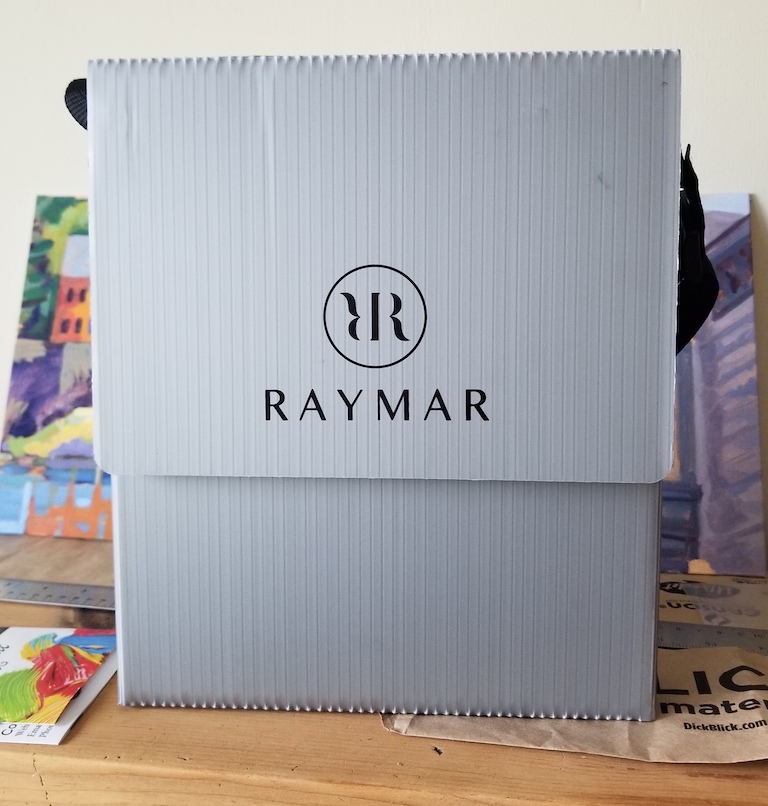
My plein air experiences began with lugging around a heavy, large French easel that tenuously held only one painting on the easel stand. After doing this a couple of times, I decided that I needed a dedicated wet painting carrier that held multiple panels and was lightweight.
I’d like to mention that I’m not getting paid for this recommendation although I wouldn’t be against that. I just think this is a very good, useful product and it could be a good addition to your plein air equipment.
Why use a wet painting panel carrier at all?
To carry and store your wet paintings when plein air painting
It’s a necessary piece of equipment especially when you’re producing multiple paintings
Convenience! It removes the hassle of carrying a wet painting in your hands
Advantages of using the Raymar carrier?
Every company that produces a pochade box most likely makes a wet painting carrier. Sometimes, the panel carrier is incorporated into the pochade box and sometimes it’s an entirely separate item. The problem with both of these options is that they’re heavy. In comes the Raymar wet painting panel carrier. It has 3 slots that can hold six 1/8” painting panels back-to-back (although I only use it for three panels). It’s made of fluted plastic making it lightweight and waterproof.
NOTE: this product holds painting panels not canvases.
As a backpacker, I’m very conscious of how much things weigh and what a drag it is to carry unnecessary weight. This product’s light weight was a big selling point for me. The price depends on the size. I went with the 8” x 10” although they have different size carriers and multi-width carriers. My 8” x 10” set me back $35 (including tax and shipping). This seems a bit pricey for plastic but it’s worth the cost (and convenience) as it’s a very sturdy item.
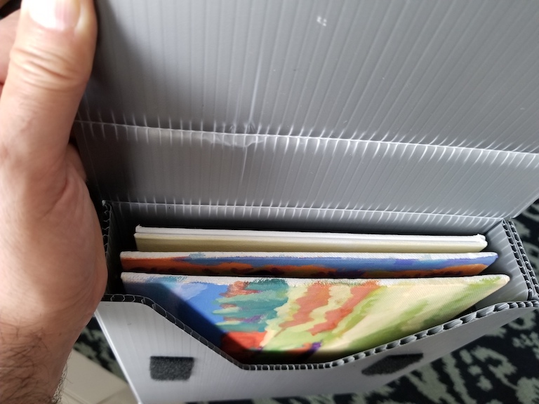
Inside of the Raymar wet painting carrier
Above is the Raymar wet painting carrier in action. See the two canvas panels in one slot? It has a velcro closing lid and adjustable strap for easy transport
Summary
A dedicated wet painting carrier will simplify your plein air painting process
The Raymar wet painting carrier comes in different sizes (and multi sizes) to hold different size panting panels
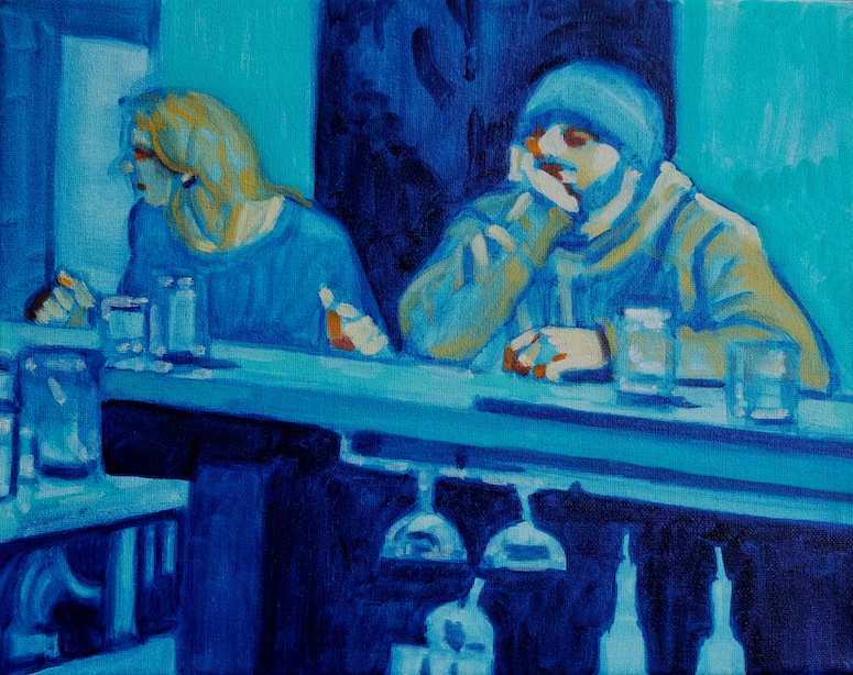
“Forever” by Frank Silva on view at Hoboken Arts Online Gallery
One of my paintings is currently on view in an online exhibit at Hoboken Arts. The group show titled “Transformative, Picturing Life after the Pandemic” showcases 40 artists and their interpretation of the theme. Each detail of the artwork includes the artist’s description of the piece and its relationship to the theme. Kudos to Hoboken Arts for using this format as the viewer is able to understand the thought process of the artist and what they’re experiencing during this time. Click here for a detailed view of my painting and description. Click here to view the entire exhibit.
The concept
My oil painting titled “Forever” was painted in the early stages of the pandemic. Coincidentally, I had started a series of paintings with the theme of “Isolation” and “Self-Isolation”. This painting deals with isolation in a social setting. I wanted to convey detachment and separation; the figures are together but not interacting with one another. The bar creates a physical separation between two worlds: the world of the patrons and the world of the bar area (or presumably, bartender). The patrons being unaware of what goes on behind the bar.
My painting process
I wanted to create an apathetic mood by using cold blues. I used varying hues and tones of blues and emphasized loose brushwork. The only yellows exist in the figures helping them to stand out against the cool blues of the rest of the scene. To draw the viewer’s attention even further, I added dabs of oranges only on the faces and hands helping to make the figures more relatable.
The show is on view through May 31, 2020
What do you think about the exhibition? Please share your thoughts.
Have you ever worked on a plein air painting only to realize that some serious compositional issues existed halfway through the painting? The purpose of this post is to show you how you can use thumbnail sketches to work out these problems before you lay down any paint.
What are the advantages of using thumbnail sketches?
To quickly sketch different views of the subject matter
To crop a view to make it more visually interesting
Thumbnails help establish a strong composition
They reduce visual elements to values and shapes thereby making the painting process easier
What’s the process for creating thumbnail sketches?
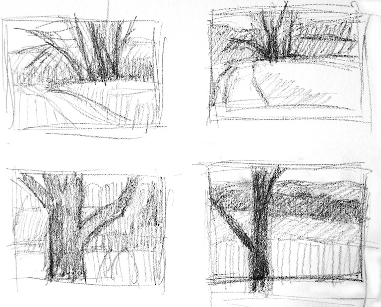
I start with a 5b or 6b drawing pencil which allows me to get a dark black. I quickly sketch a small box (approximately 2”x3”) that’s proportional to the canvas or panel that I’ll be painting on. I sketch loosely and reduce the subject matter to simple, large shapes and tonal values. I limit my sketching time to 3 or 4 minutes to avoid getting bogged down with any detail. Finally, I use this thumbnail to lay out my painting.
Using this method I can create different thumbnails from different angles giving me options to choose from. Additionally, these sketches help me decide what view will work out best as a painting.
Examples of usage
Please note the four thumbnails on the top of this post. I’ve sketched out a couple of thumbnails to choose from. I think the top two are boring . The bottom two have a better composition with a strong focal point. But the bottom-right one is a better value study and I chose this one to create a painting.
Below you can see the quick thumbnail sketch that I used to begin the painting on the right. Looking back, I should’ve better developed the different values in the thumbnail.
Thumbnail tonal sketch on the left and beginning stage of the plein air painting on the right
How they improve your plein air painting
A thumbnail sketch will quickly show if a view is worth painting
Give the ability to crop or change elements that won’t work in the painting
Help in the painting process by simplifying the view to simple shapes and tonal values
You can quickly rework elements to improve the composition
Summary
When painting plein air, use thumbnail sketches to quickly lay out your painting
Sketch out approximately 2”x3” boxes that match the proportions of your painting surface
Work out any compositional issues in the thumbnail
Establish tonal values in the thumbnail that can transferred to the painting
Use the thumbnail to lay out your painting
Do you use thumbnail sketches when painting plein air? How do you avoid compositional problems?
Photo of the canvas toning process using Ultramarine Blue and Burnt Sienna
Why do you tone a canvas?
To make a “white” canvas or panel less intimidating to paint
Toning creates a neutral background
It covers the entire surface leaving no areas of blank (white) canvas
How do you tone a canvas for oil painting?
In my experience earth colors work best. My preferred color is Burnt Sienna but I’ve also used Burnt Umber. Additionally, I’ve experimented with Ultramarine Blue and Perylene Red.
I use a rag dipped in Turpenoid. Then I dip the rag into a glob of paint on my palette. Finally, I cover the canvas with a thin layer of that paint. Make sure to let the background color fully dry before you begin painting. If wet, any colors you apply will mix with the background and muddy your colors.
CAUTION: Be careful when using strong colors like Ultramarine Blue or Perylene Red. When I’ve used Perylene Red, I struggled throughout the painting process to tame the strength of that color. This can be very frustrating.
Examples of usage
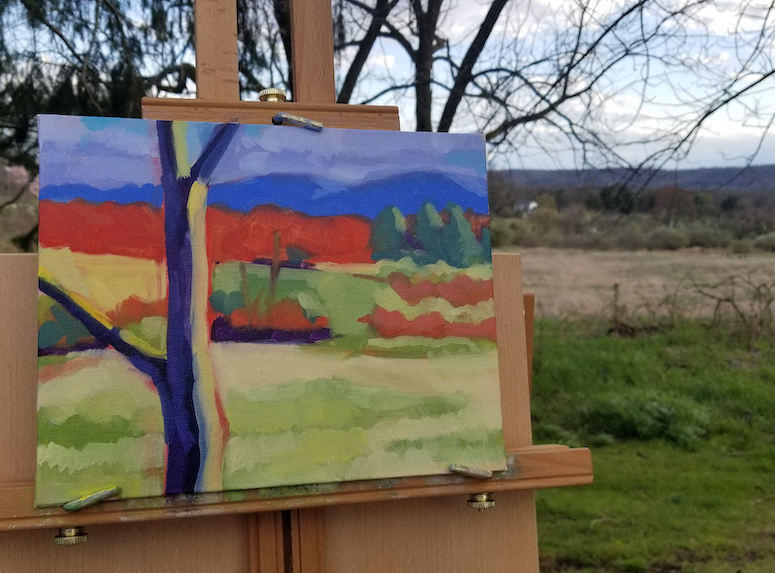
Plein air landscape painting on easel by Francisco Silva
In the plein air painting above I used a Burnt Sienna background. Although strong colors dominate this painting, you can see hints of the background color through some parts it. Look at the reds as well as the yellows in the lower part of the painting.
“Forever” oil painting by Francisco Silva
“Forever” shows the usage of an Ultramarine Blue background. After my negative experience using Perylene Red, I used this blue background as a foundation for a monochromatic painting. The blue contrasts nicely with the highlights as well as the yellows in the painting.
How it improves your painting
It creates a neutral base that you can build upon
It’s particularly helpful when plein air painting when you’re fighting against time to capture a scene. The neutral background covers the entire panel eliminating the need to cover it with the paint you’re applying.
Summary
Tone your canvas to create a neutral background
Use earth colors (Burnt Sienna, Burnt Umber)
Be cautious of using strong colors as a background
Toning creates a layer of color that you can build on
Helpful when plein air painting as you have a limited time to paint
Do you tone your canvas? What color(s) do you use? What have been your experiences with toned canvases?